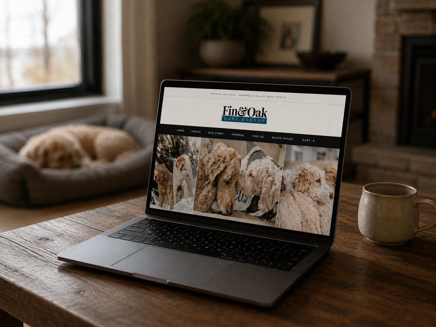
01 — The hero photos
Most pet food brands lead with the product. We led with Oak and Piper because the whole point of Fin & Oak is who's behind it and who it's for. You should feel that before you read a single word.
02 — The headline
You want your website to feel like something the second you land on it. "Small batches. Big messes. Happy critters." does that. It tells you exactly what it's like in this kitchen before you've scrolled, clicked, or read anything else.
03 — The subhead copy
"The rest of the menagerie" is the phrase you use when you've genuinely stopped counting. Two dogs, six cats, chickens with strong opinions, geese who don't like anyone. This is a real house. The copy should sound like it.
04 — "Real ingredients. Spoiled regulars."
What's in it, and is it worth it. Two questions, six words. "Spoiled regulars" also does something quietly useful: it tells you people come back. No testimonials needed.
05 — Willow & Mom
Three words that tell the whole story. You know exactly who made this before you've read anything else on the page. That's the whole point of signing off with names.
06 — The logo
We needed something that could live on a website, stamp onto a bag, and shrink down to a sticker without falling apart. Playfair gave us the presence and polish without tipping into cute territory, which was the line we were trying not to cross. "Bark Bakery" tracked out underneath grounds it and makes the whole mark stamp cleanly. No icon needed. The type does the work.